ANIMATE! (with CSS)

Josh Netherton

@joshnetherton

codepen.io/joshnetherton
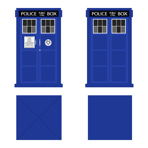
What we're doing

  1. 2D Transforms
  2. 3D Transforms
  3. Transitions
  4. Keyframe Animations

Transforms

Transforms

Translate

Scale

Scale

Skew

Rotate

Rotate

3D Transforms

3D Transforms

Perspective

Cybermen

Cybermen

Cybermen

Cybermen

Cybermen

Cybermen

Cybermen

Cybermen

Cybermen

Backface-visibility

Cybermen

Backface-visibility

Cybermen

Cube

TARDIS

3D Transform Resources

Transitions

Some things we can transition

Full list: http://dev.w3.org/csswg/css3-transitions/#animatable-properties

Transitions

#dalek {
    transition-property: tranform;
    transition-duration: 1s;
    transition-timing-function: linear;
    transition-delay: 0.5s;
}

Transitions

#dalek {
    transition: transform 1s linear 0.5s;
}
#dalek:hover {
    transform: translateX(600px);
}

Transitions

Transitions

Animations

Keyframes

Keyframes

Keyframes

Loading Animation

Loading Animation

Bounce

Bounce

Bounce

Steps

Steps

#angels-step {
    background-image: url(img/angels-step.jpg);
    animation: angels 18s steps(6, start);
}

@keyframes angels {
    from { background-position: center top; }
    to { background-position: center -2100px; }
}

Steps

#angels-step {
    background-image: url(img/angels-step.jpg);
    animation: angels 18s steps(6, start), blink 3s linear 5;
}

@keyframes angels {
    from { background-position: center top; }
    to { background-position: center -2100px; }
}

@keyframes blink {
    0% { opacity:1; }
    97% { opacity:1; }
    98% { opacity:0; }
    100% { opacity:0; }
}

Steps

Process

Storyboarding

To-do list

  1. Create the design assets
  2. Build the Tardis
  3. Code our animations
    • Tardis appearing
    • Tardis rotating
    • Tardis moving in space
  4. Put it all together

Create the images

Our TARDIS

Appearing

Rotating

#tardis-3d-rotate {
    animation: spin-start 2s ease-in 1 1s, spin 1.2s linear infinite 3s;
}
@keyframes spin-start {
    from { transform: rotateY(0deg); }
    to { transform: rotateY(-360deg); }
}
@keyframes spin {
    from { transform: rotateY(0deg); }
    to { transform: rotateY(-360deg); }
}

Moving away

#tardis-3d-container-move {animation: tardis-move 5s ease-in 1;}
@keyframes tardis-move {
    0% { transform: translateX(0px) scale(1); }
    30% { transform: translateX(500px) scale(.6);}
    70% { transform: translateX(200px) scale(.1);}
    100% { transform: translateX(-90px) scale(0);}
}

String the animations together